The Challenge
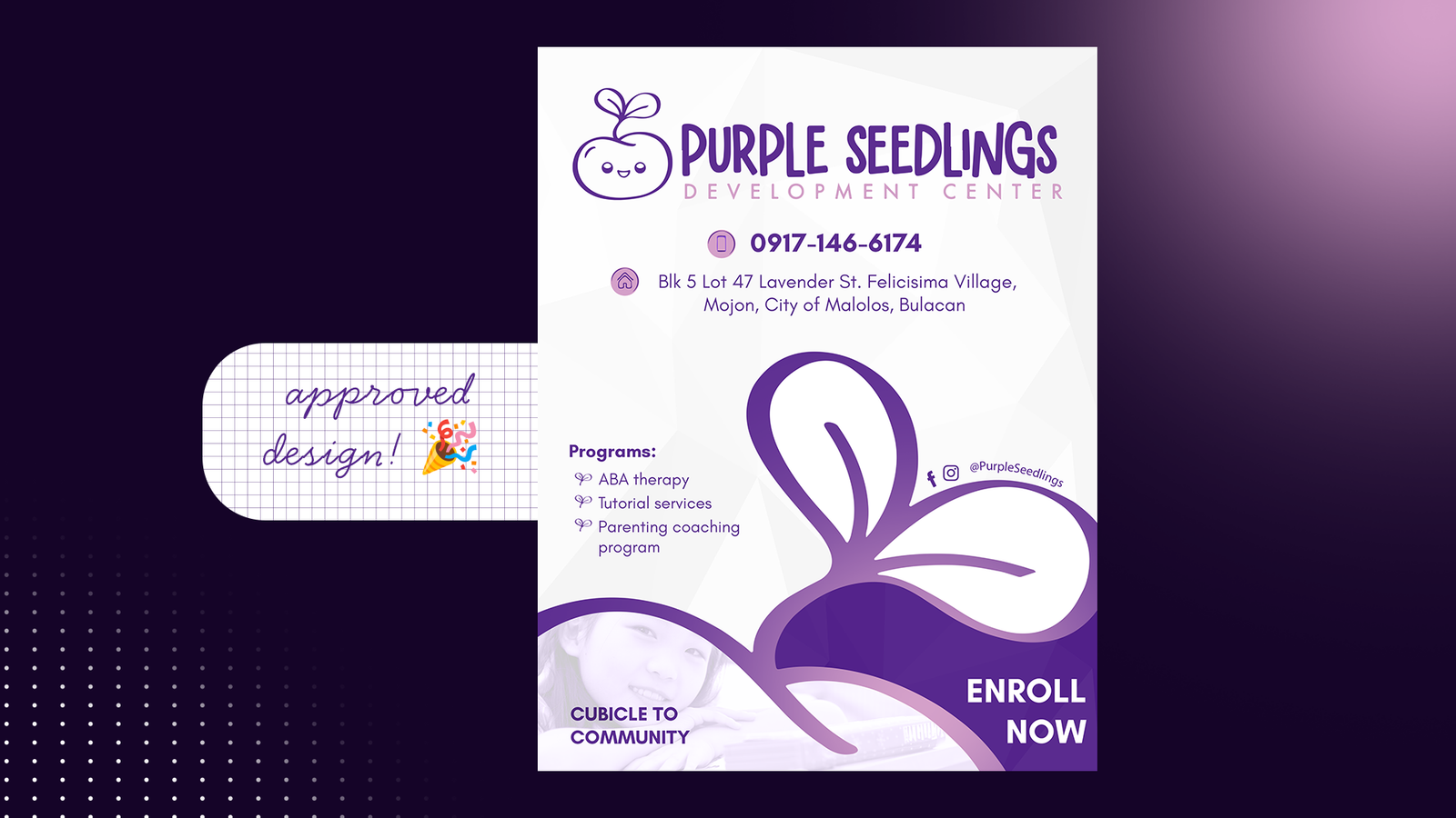
Purple Seedlings Development Center needed enrollment communication that parents could understand at a glance without making therapy services feel clinical or intimidating. The goal was to balance practical information with a visual tone that felt warm, reassuring, and child-centered.
The opportunity was bigger than arranging information on a poster: the campaign needed a recognizable idea that could make the brand feel nurturing while still giving programs, contact details, and calls to action a clear hierarchy.
Creative Idea — Growth
The visual direction was built around growth. The seedling became more than a logo element: it worked as a metaphor for development, care, progress, and the small steps that families and children take over time.
That idea shaped the use of soft purple, rounded organic forms, child-focused imagery, and a layout that guides the eye from the emotional message into the practical enrollment details.
Visual Direction
The system was designed to feel friendly first, informative second, and promotional third. Purple gives the campaign a memorable brand signature, while generous spacing and controlled hierarchy keep the parent-facing information approachable.
The large organic seedling shape carries the identity through the composition without competing with the child image. Typography, QR placement, social touchpoints, and program details are organized so the piece can be scanned quickly from headline to action.
Exploration — Structure Before Styling
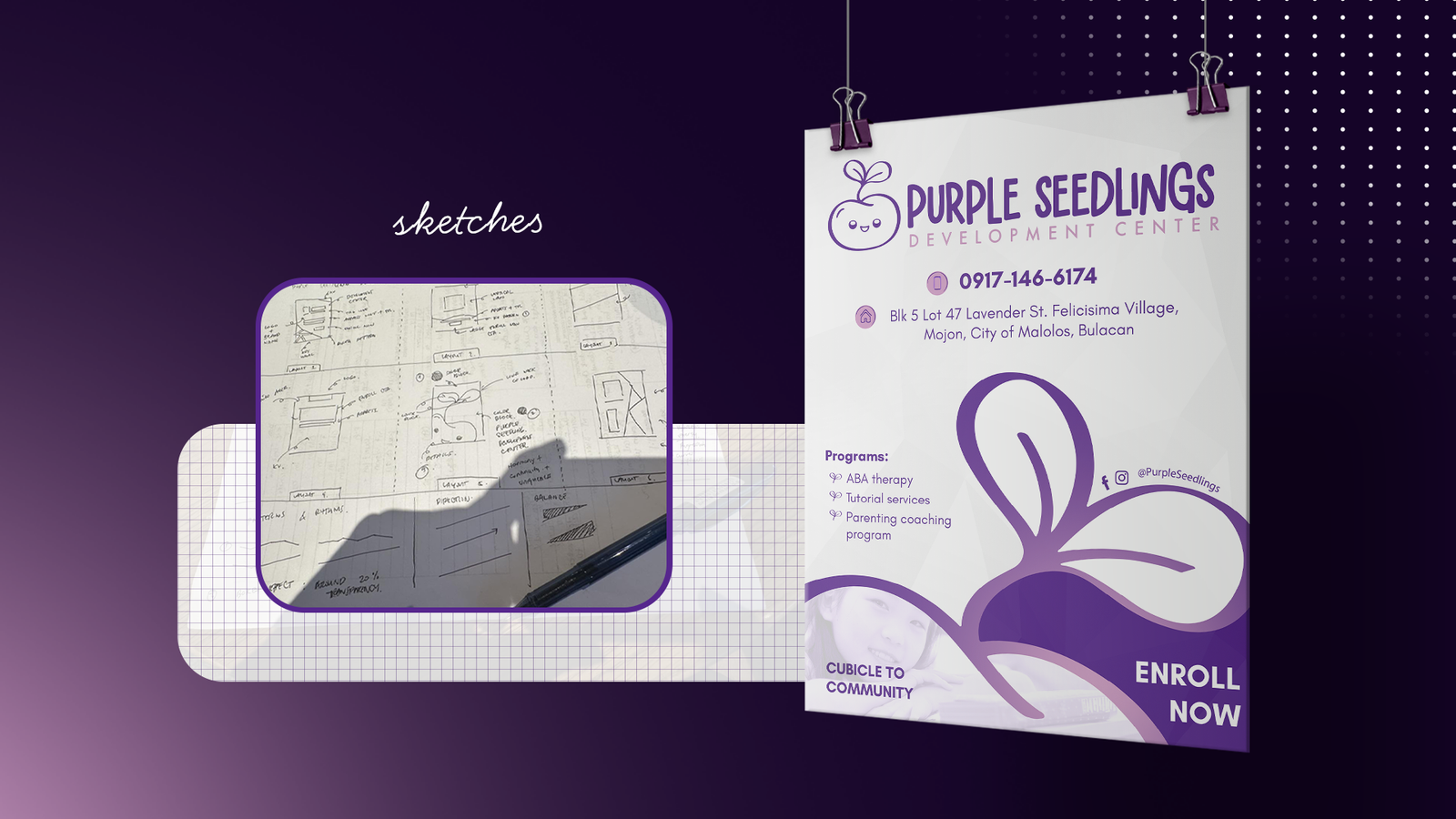
Early sketches focused on the communication architecture: where the logo should live, how the headline and contact information should be prioritized, how much space the child image needed, and how the seedling form could move the eye through the layout.
This stage helped separate the core communication problem from surface styling, so later visual decisions could be judged by clarity rather than decoration alone.
Design Studies — Testing the Tone
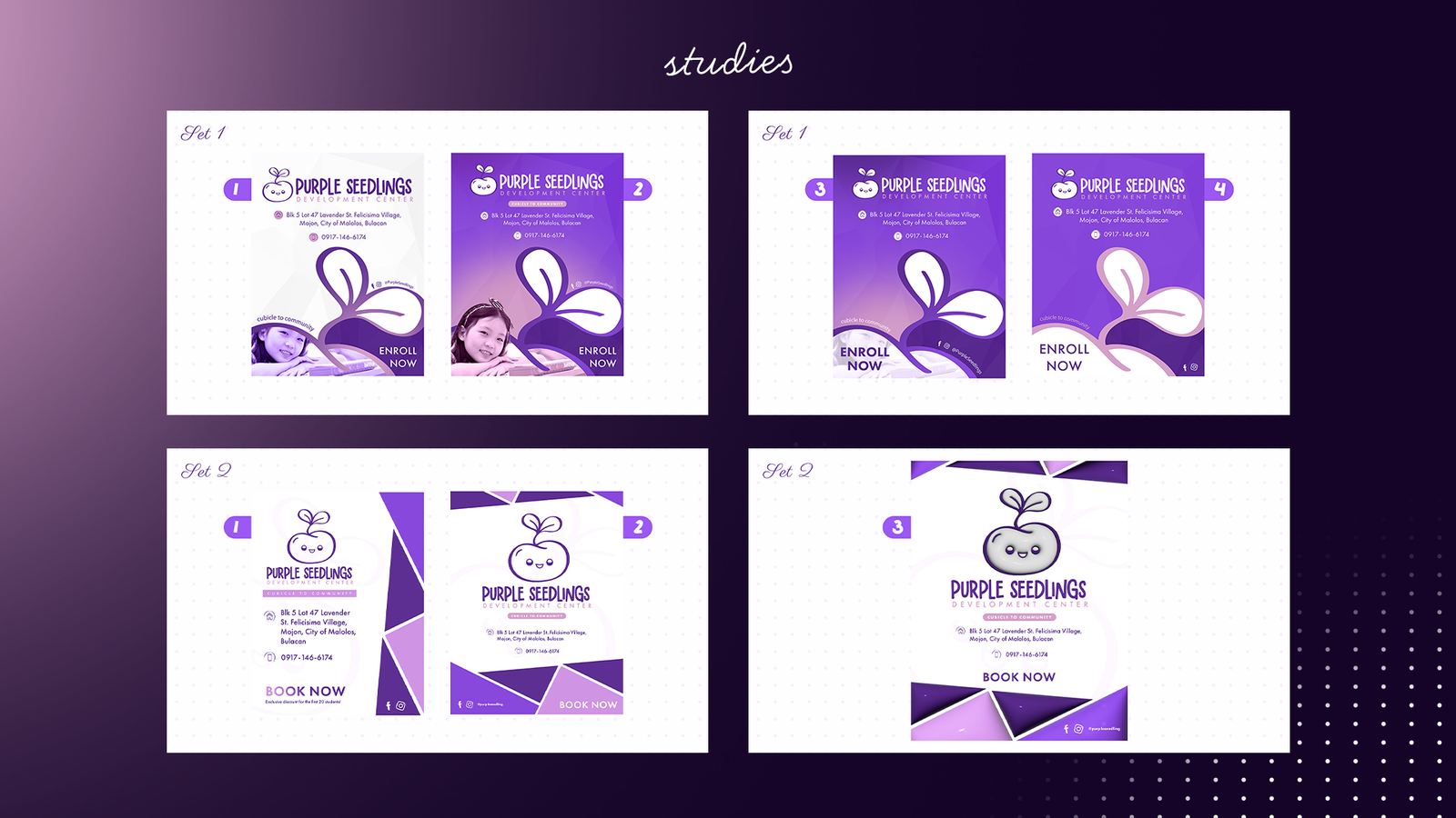
Multiple routes explored how expressive the campaign should feel. The studies tested lighter and fuller purple compositions, different image scales, alternative calls to action, and different balances between illustration and information.
Playful direction: more expressive shapes and a stronger sense of movement. Minimal direction: reduced visual noise and more breathing room. Informational direction: stronger emphasis on services, contact points, and enrollment clarity.
Selection — Warmth Meets Readability
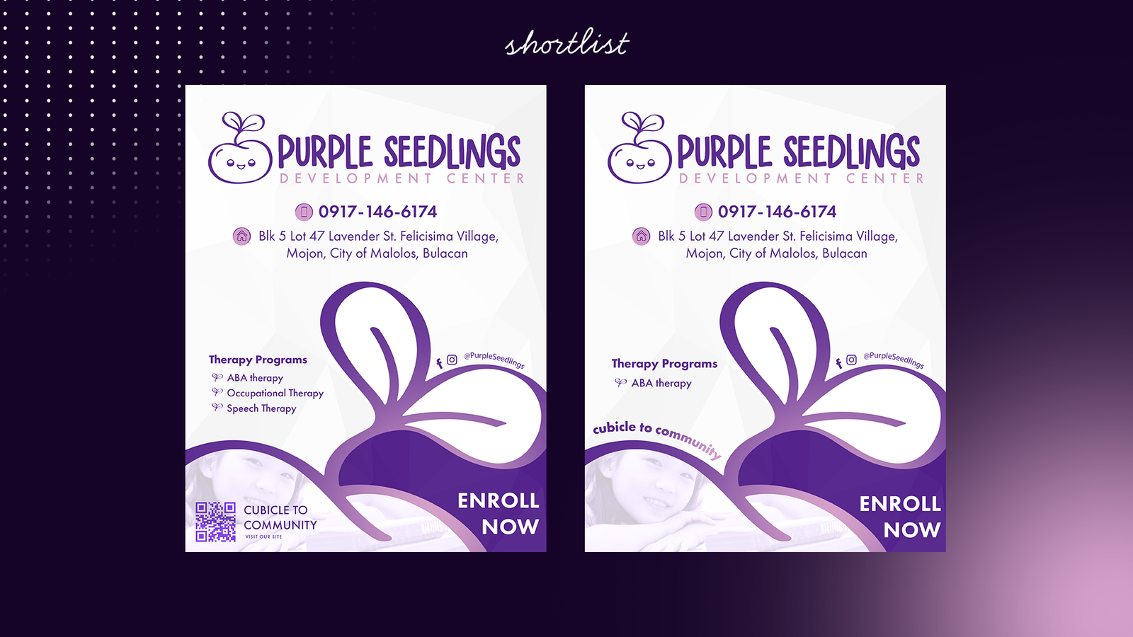
The shortlist narrowed the work to the directions that best balanced emotional warmth with fast information recognition. The selected route kept the friendliness of the more playful concepts while adopting the stronger hierarchy and restraint of the more structured layouts.
Concept Extensions — Portfolio Applications
The approved poster is the original client-facing deliverable. To demonstrate how the visual idea could grow beyond that format, additional applications may be developed as concept extensions for the portfolio rather than presented as part of the original client scope.
These extensions can explore how the same purple field, organic seedling forms, child-centered photography, concise messaging, and enrollment hierarchy translate into social posts, digital announcements, parent information pieces, and other touchpoints while remaining recognizably Purple Seedlings.
Outcome
The final direction turned practical therapy-program information into a warmer and more recognizable enrollment experience. It gives Purple Seedlings a visual voice that feels caring and credible while making the next step for parents easy to find.
One growth idea. A clear parent journey. A campaign language built to extend.