The Challenge
Dry Horizons brought together ophthalmology, research, innovation, and industry around the evolving future of dry-eye care. The challenge was to create more than an event logo: the identity needed to feel clinically credible, forward-looking, and flexible enough to work across stage, digital, print, and physical event environments.
The Insight
The name Dry Horizons already contained the central idea. A horizon represents something we move toward. In ophthalmology, that became a metaphor for discovery, emerging treatments, new technologies, and the collective pursuit of better patient outcomes.
Creative principle: Progress appears on the horizon.
The Big Idea — Signals Toward a New Horizon
Instead of relying on literal eye imagery, the visual system turns the horizon into a field of individual points. Those points can read as research signals, data, discoveries, patient pathways, technologies, companies, and people. Individually they are separate; together they form a direction.
Exploring the Identity
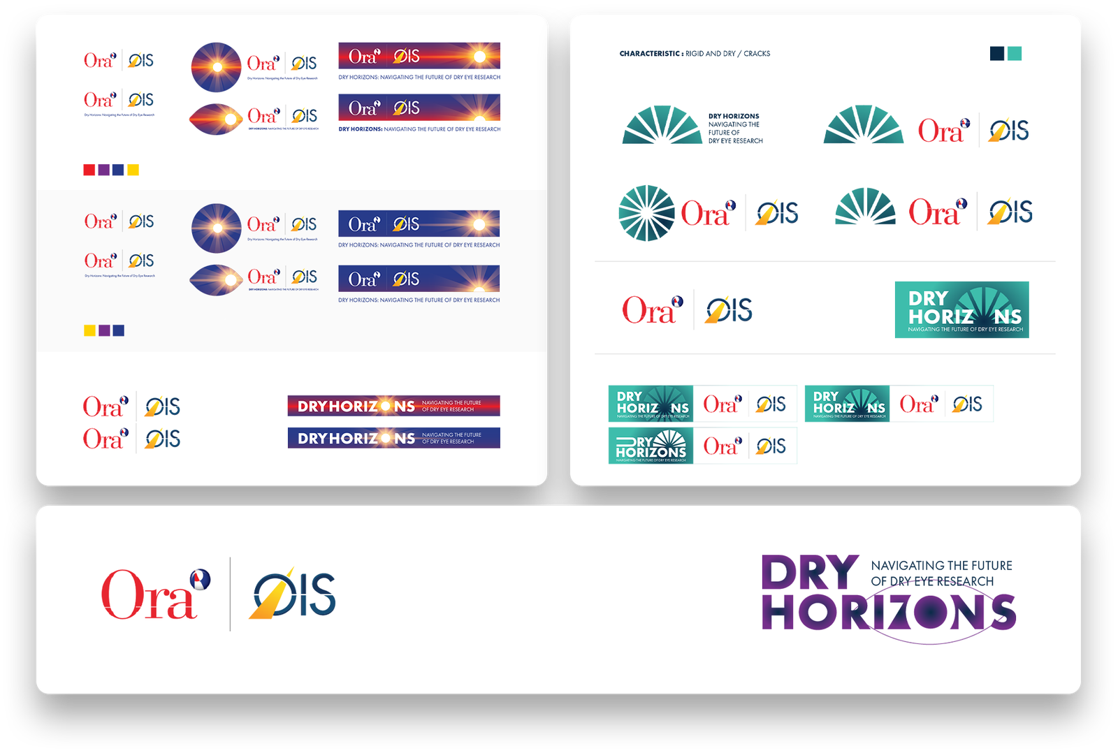
Early studies tested different ways to connect the Dry Horizons name to ophthalmology. More literal horizon and sun directions communicated the name immediately, but risked feeling closer to lifestyle or wellness branding. More clinical and ocular directions felt appropriate to the category, but too familiar. The selected dotted-horizon route created a more ownable link between the event name and the worlds of research, technology, data, and scientific progress.
The Identity System
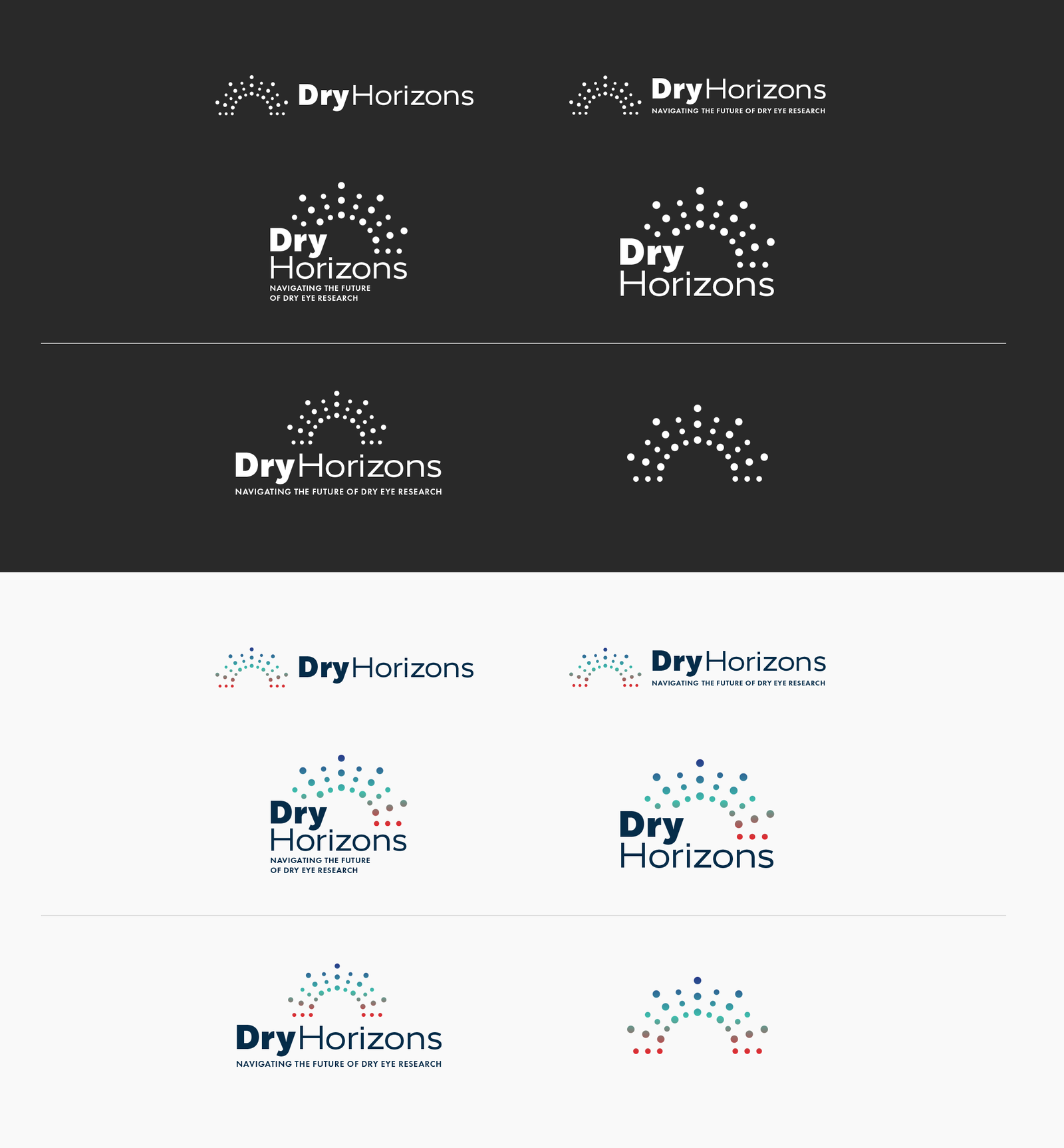
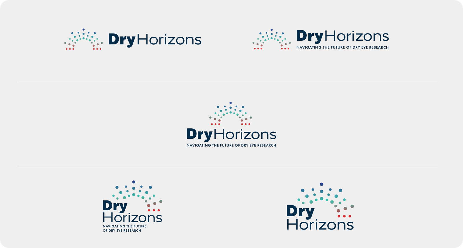
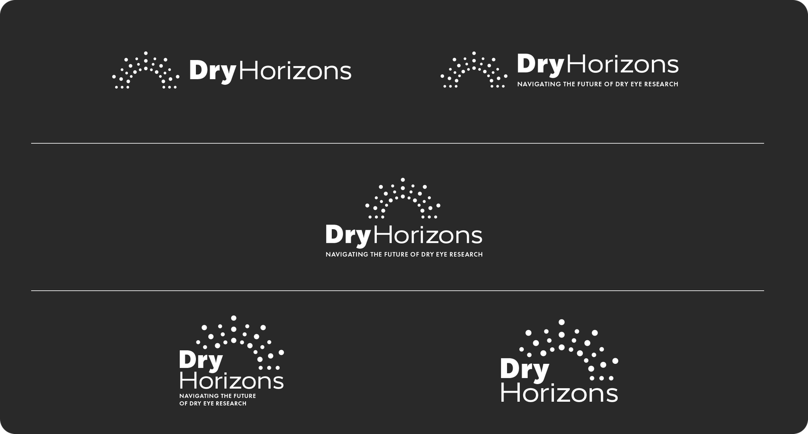
The final mark pairs a clean wordmark with a modular dotted horizon symbol. The symbol was designed to work beyond the logo itself, becoming an organizing device that could scale from small digital placements to large stage and environmental applications.
Color as a System
The palette uses deep navy as the primary event environment, teal as the main signal color, blue to extend the technology and innovation language, and red as a controlled accent for moments that need interruption or emphasis. Rather than giving every color equal weight, the palette establishes hierarchy across stage, digital, and printed applications.
Designing for the Stage
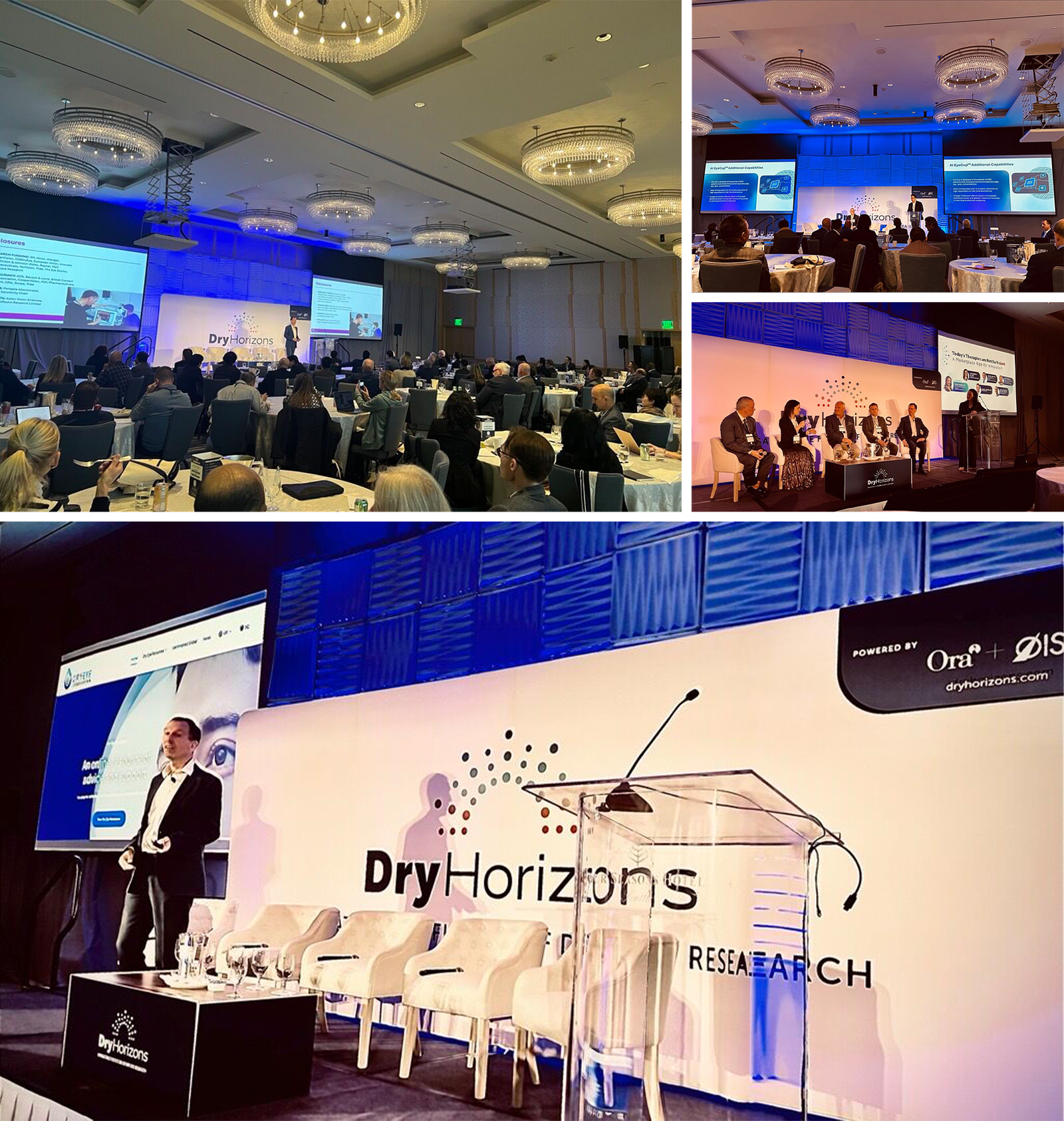
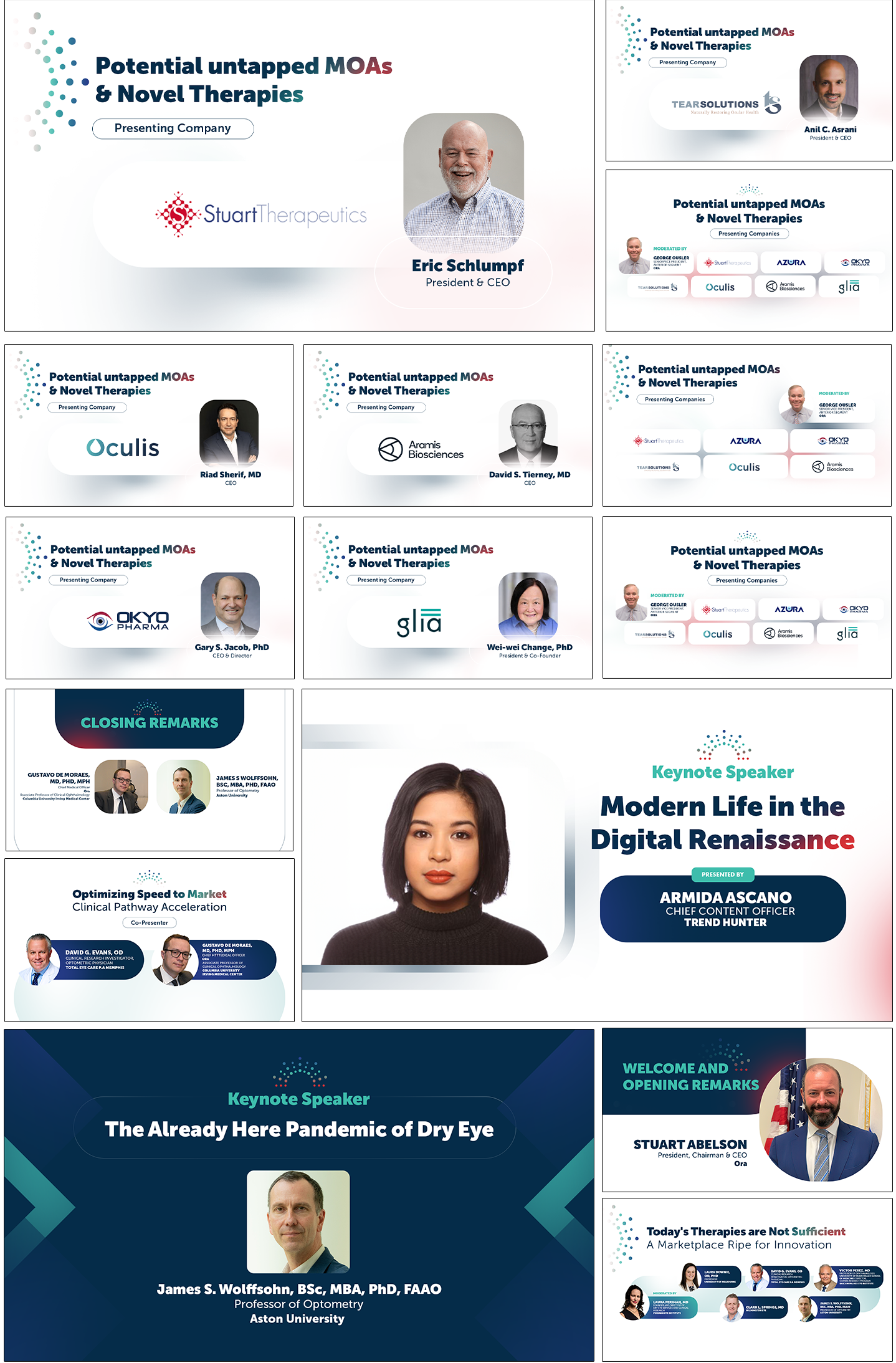
The live stage was one of the identity system's most demanding applications. Large-format screens had to remain clear from a distance while accommodating constantly changing speakers, companies, sessions, and panel formats. Strong contrast, controlled typography, and repeatable structures allowed the brand to stay present without competing with the content.
Session Design System
Rather than designing every session screen independently, the presentation language was built as a repeatable system. It needed to handle session titles, speaker portraits, moderator information, company identities, panel lineups, keynote moments, and closing remarks while still feeling like one event.
Designing the Attendee Experience
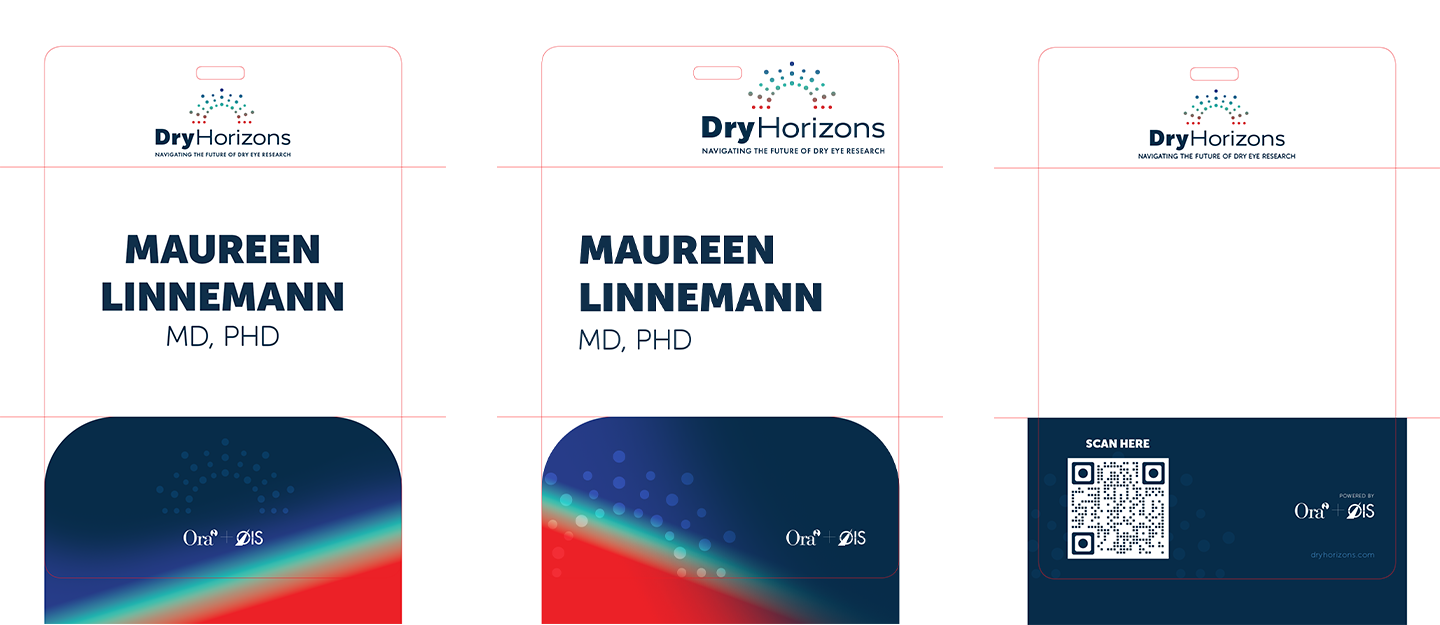
The identity extended beyond the stage into the practical details of attending the event. Badges and attendee materials prioritized fast information recognition while preserving the premium clinical tone of the broader system. Names, organizations, sponsor marks, and QR interactions were organized for real-world usability in a busy conference environment.
From Digital to Physical
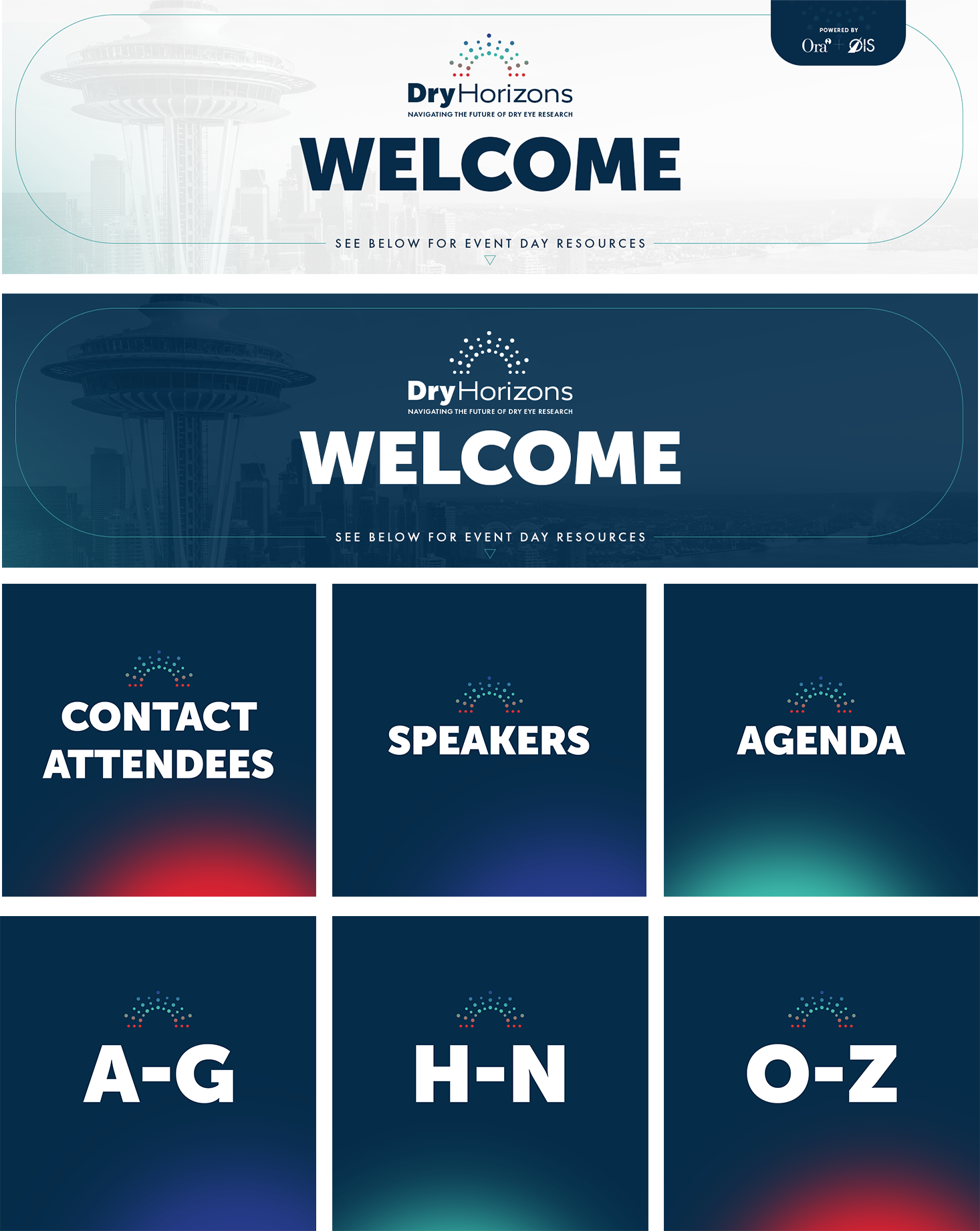
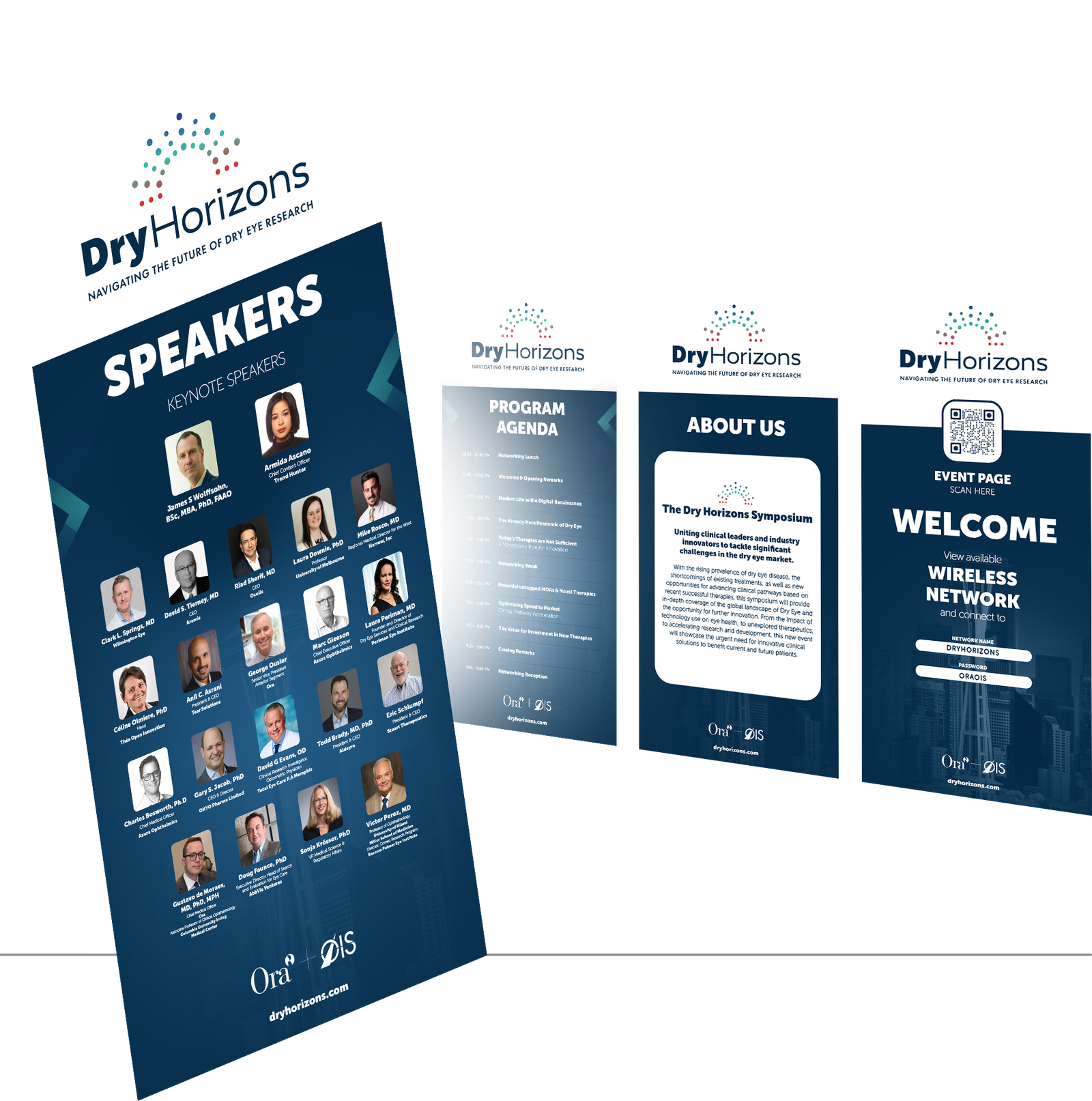
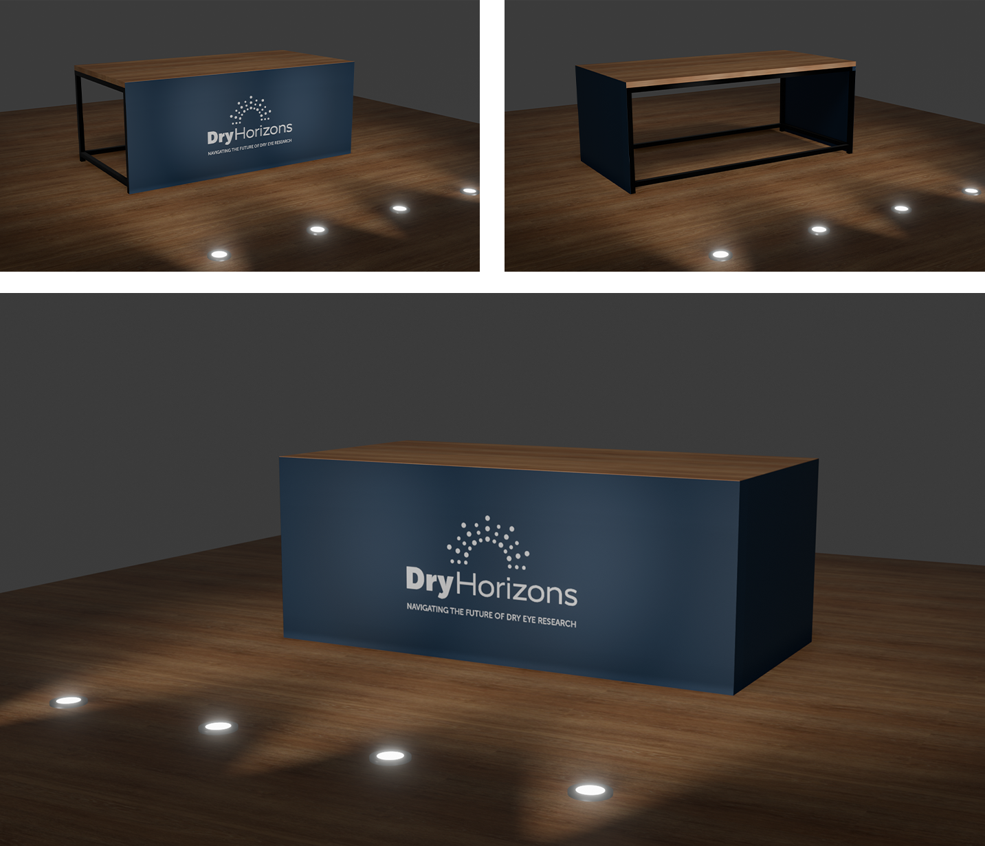
The same visual vocabulary was extended across website resources, speaker graphics, agendas, attendee directories, welcome signage, X-frames, information panels, and branded table covers. Treating these as parts of one system helped attendees encounter a consistent Dry Horizons world before and throughout the event.
Motion Direction — Proposed Extension
The dotted-horizon concept also creates a natural foundation for motion. A future motion system can follow a simple behavior: Signal → Converge → Horizon → Reveal. Individual points enter independently, begin moving toward a shared direction, resolve into the recognizable horizon, and then reveal speakers, sessions, titles, or event content.
This gives the identity a consistent way to behave across logo animation, speaker introductions, session transitions, countdowns, lower thirds, and social content without relying on unrelated transition effects.
Outcome
The final system gave Dry Horizons a cohesive presence across stage, digital, print, and physical event touchpoints. More importantly, it demonstrated how one conceptual device—the horizon—could grow from a logo into a complete event experience while maintaining the scientific credibility expected of an OIS program.
One idea. Multiple touchpoints. One visual world.