The Challenge
Asia Pacific Alliance for Disaster Management Philippines needed an event-signage system that could represent multiple regional networks under one recognizable APAD identity. Each banner had to carry urgent disaster-management messaging while also accommodating local chapter names, partner organizations, sponsor marks, and contact information without becoming visually crowded.
Communication Strategy
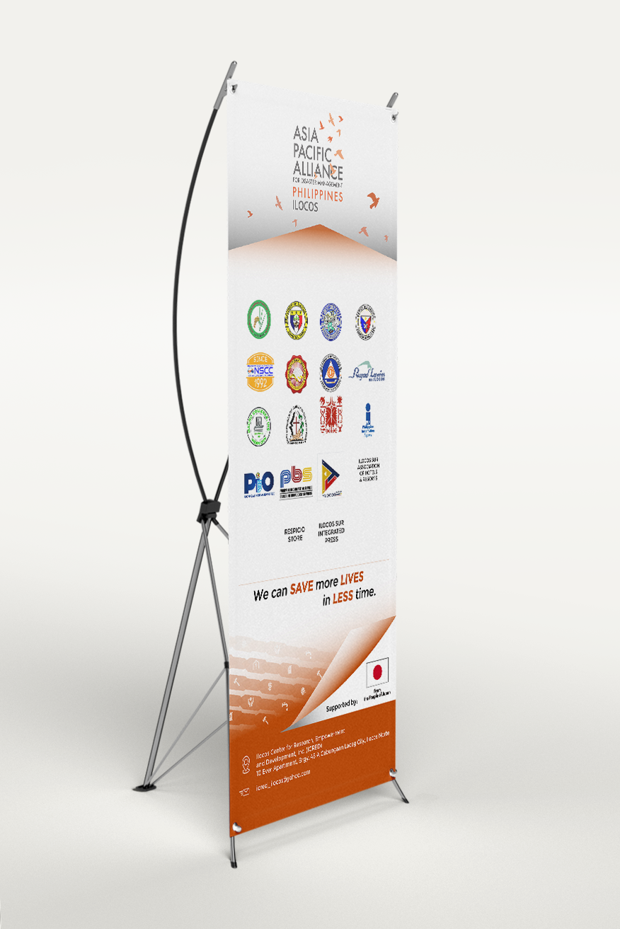
The system was built around a clear information hierarchy: APAD identity first, regional network second, partner organizations third, then the shared disaster-management message and supporting contact details. This structure made each banner easy to scan from a distance while preserving visibility for the organizations represented.
Visual System
A restrained white field keeps the dense partner information readable, while warm orange accents provide urgency and connect the layouts to disaster-response communication. A horizon-like graphic form and bird silhouettes add movement and a sense of coordinated action without competing with the functional content.
One System, Multiple Regions
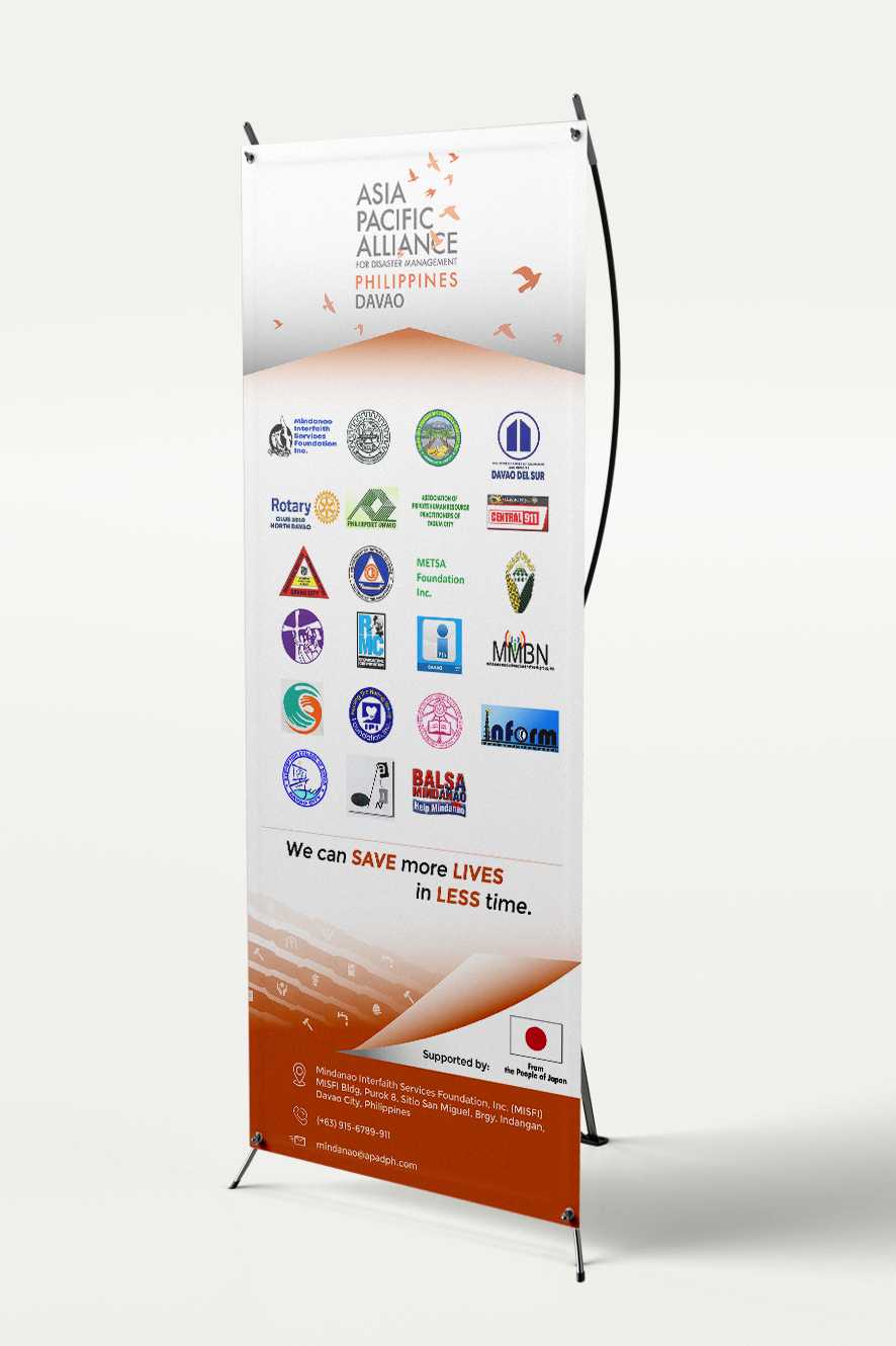
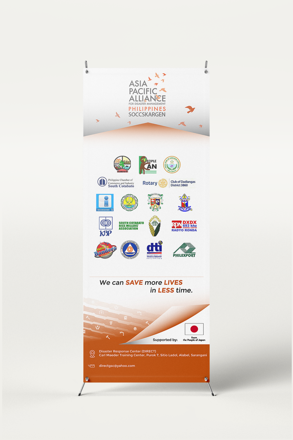
The design separates fixed elements from variable content. APAD branding, the orange visual language, campaign hierarchy, and overall grid stay consistent. Regional names, partner logos, supporting organizations, and local information change from banner to banner. That modular approach keeps the family recognizable without forcing every region into identical content.
In-Environment Application
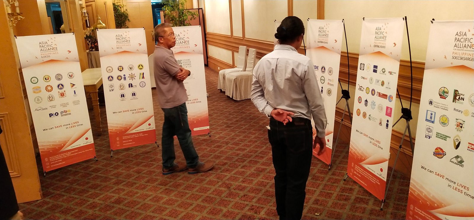
The x-stands were designed to function both individually and as a group. In a conference or coordination space, repeated brand placement and consistent orange anchors help the banners read as one APAD system, while the regional labels and partner marks allow visitors to distinguish each network quickly.
Production Considerations
The final layouts prioritize distance readability, logo separation, high-contrast messaging, and a stable lower information band. These decisions support the practical constraints of large-format print while keeping the system flexible enough for multiple regional versions.
Outcome
The finished signage system gave APAD Philippines a repeatable visual framework for regional events. Rather than treating each x-stand as a separate poster, the project unified multiple local networks through one modular structure while preserving the identity and visibility of each partner group.
One system. Multiple regions. Consistent identity.